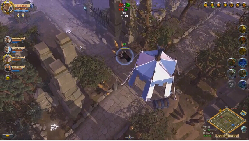
Today we will share with you some tips in Albion Online to make the game feel really well built. Here we go:
Have mobs drop a range of silver, not a static number.
Different Mouse-over icons for the various gathering materials: Axe = wood, pick = ore, etc.
- Loot needs to be highlighted when behind trees/etc.
- Blood splatters when Demo-ing buildings. Olly makes sense if they’re mutated zerglings
- The sound for adding resources to buildings doesn’t fit, just sounds like a sword swinging at air
- Volume Slider for Mount Movement/Steps would be nice as it tends to be significantly louder than everything else around and can be obnoxious.
- Increased base carrying weight seems useful or a slower reduction in movement based on weight. I max out on weight pretty quickly and it just “feels” like a longer time would be helpful. Then again, the world is much emptier than it would be at launch so I’m able to gather materials a lot faster than I could in that situation and it might fit better at that time.
Variety in monster/mob attack sequences/spell casts and Variety in damage output. Hitting for 39 every time I swing on a mob that does the same sequence of attacks and spellcasts turns into an incredibly repetitive combat encounter.
A suggestion to consider, not saying I’d recommend it, just something for more game-design savvy people to think about: Reset the materials needed to make T5+ processed goods so that T5 needs no pre-requisite, just like T1/Some T2. Then T6 needs a processed T5 + raw T6, same w/ T 7 and 8 etc. It seems like it would be a nice refresher after working your way up to T4 and could help reduce some of the monotony of always having to go back to low-tier resources.
- Create a purpose for the random buildings, ruins, etc placed everywhere. Give them some things to search, destroy, have them randomly spawn mobs/bosses, etc.
- Add tank viability w/ swords? Just a preference by me here.
- Better visibility in large-scale combat. Distinguishing between allies, enemies, PVE mobs, etc, can’t be extremely difficult. Allow me to turn off allied cast bars so I can see enemy cast bars better. A better indicator of who my target is would be nice so I don’t get lost on where it went in hectic combat. Also, an auto-target feature would be useful as when the battlefield is cluttered, I’m often unable to target an enemy because my allies are crowding it.
Designation for weapons to show if they are 1h or 2h.
